grid_layout
A layout that organizes cells into a grid table structure.
Author(s): Kevin Matocha, Tim Cocks
Implementation Notes
Hardware:
Software and Dependencies:
Adafruit CircuitPython firmware for the supported boards: https://github.com/adafruit/circuitpython/releases
- class adafruit_displayio_layout.layouts.grid_layout.GridLayout(x, y, width, height, grid_size, cell_padding=0, divider_lines=False, h_divider_line_rows=None, v_divider_line_cols=None)
A layout that organizes children into a grid table structure.
- Parameters
x (int) – x location the layout should be placed. Pixel coordinates.
y (int) – y location the layout should be placed. Pixel coordinates.
width (int) – Width of the layout in pixels.
height (int) – Height of the layout in pixels.
grid_size (tuple) – Size in cells as two ints in a tuple e.g. (2, 2)
cell_padding (int) – Extra padding space inside each cell. In pixels.
divider_lines (bool) – Whether or not to draw lines between the cells.
h_divider_line_rows (Union[tuple, list]) – Row indexes to draw divider lines above. Row indexes are 0 based.
v_divider_line_cols (Union[tuple, list]) – Column indexes to draw divider lines before. Column indexes are 0 based.
- add_content(cell_content, grid_position, cell_size)
Add a child to the grid.
- Parameters
cell_content – the content to add to this cell e.g. label, button, etc… Group subclass that have width and height properties can be used.
grid_position (tuple) – where in the grid it should go. Tuple with x,y coordinates in grid cells. e.g. (1,0)
cell_size (tuple) – the size and shape that the new cell should occupy. Width and height in cells inside a tuple e.g. (1, 1)
- Returns
None
widget
CircuitPython GUI Widget Class for visual elements
Author(s): Kevin Matocha
Implementation Notes
Hardware:
Software and Dependencies:
Adafruit CircuitPython firmware for the supported boards: https://github.com/adafruit/circuitpython/releases
- class adafruit_displayio_layout.widgets.widget.Widget(x=0, y=0, scale=1, width=None, height=None, anchor_point=None, anchored_position=None)
A Widget class definition for graphical display elements. The Widget handles the sizing and positioning of the widget.
- Parameters
x (int) – pixel position
y (int) – pixel position
width (int) – width of the widget in pixels, set to None to auto-size relative to the height
height (int) – height of the widget in pixels
anchor_point (Tuple[float,float]) – (X,Y) values from 0.0 to 1.0 to define the anchor point relative to the widget bounding box
anchored_position (Tuple[int, int]) – (x,y) pixel value for the location of the anchor_point
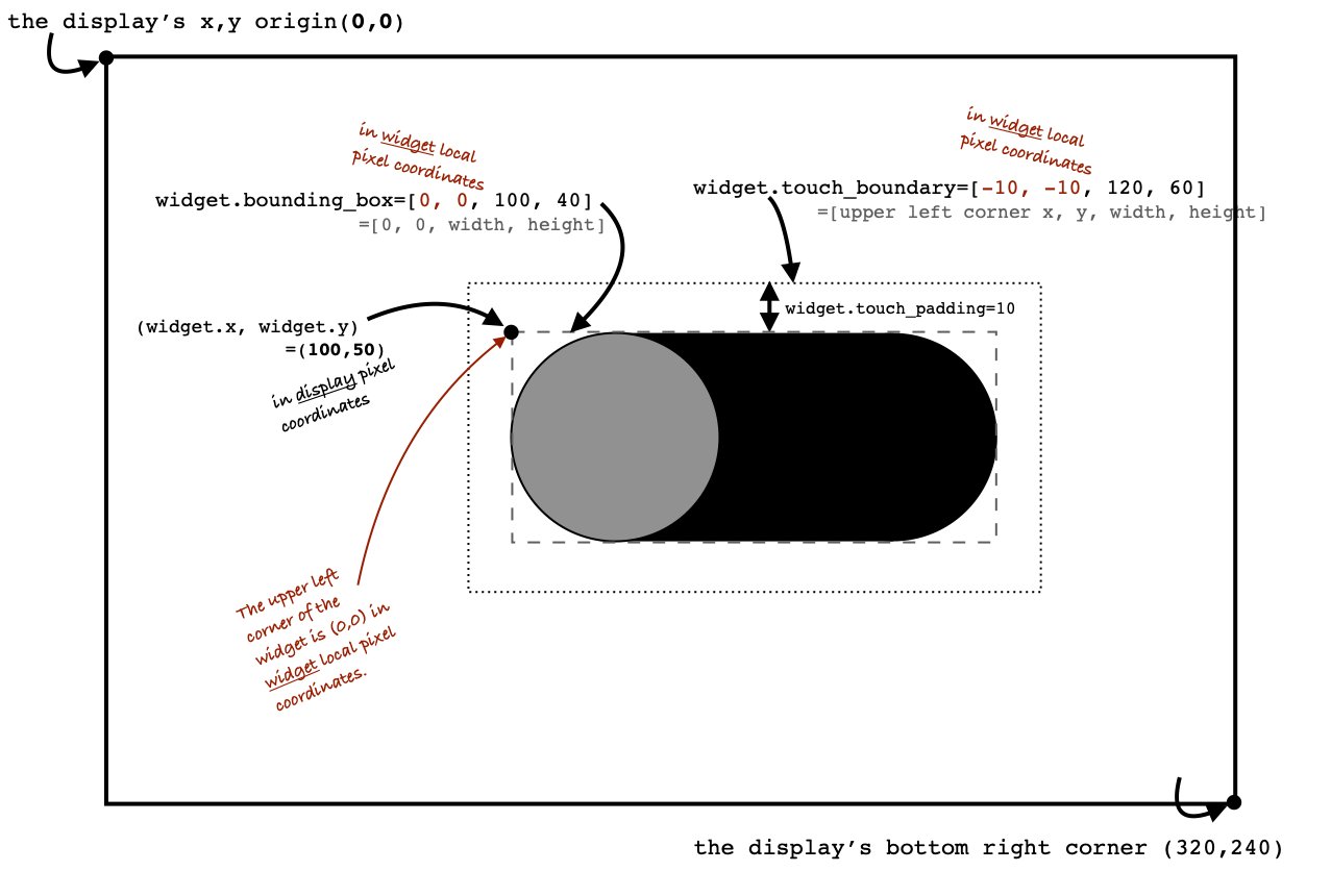
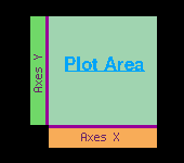
Diagram showing the global and local coordinate systems and the Widget’s associated class variables.
Widget Class Positioning: Display vs. Local Coordinates
The Widget class is used to define the position and size of the graphical elements that define the widget. The Widget is a subclass of
displayio.Groupand inherits the positioning elements ofdisplayio.Group, including x, y (in pixels). If the Widget is directly added to the display, then the .x and .y positions refer to the pixel position on the display. (Note: If the Widget is actually held within another Group, then the .x and .y of the widget are in that Group’s local coordinate system.)This Widget coordinate system is illustrated in the diagram above, showing the coordinate systems of a sliding switch widget. The display’s origin (x=0, y=0) is at the upper left corner of the display. In this example the display size is 320 x 240 pixels, so the display’s bottom right corner is at display coordinates (x=320, y=240). The upper left corner of the widget is labeled notionally as widget.x and widget.y is set at the display pixel position of (x=100, y=50).
Local Coordinates: bounding_box
Other parameters defined in the Widget class use a “local” coordinate system, as indicated by the red text in the display. These include
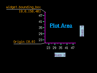
bounding_boxand touch_boundary. Thebounding_boxdefines the origin of a Widget is at the upper left corner of the key graphical element of the widget and is set to (0,0) in widget local coordinates. Thewidthandheightof thebounding_boxare defined as the pixel distances that make a mininum box that contains the key graphical elements of the widget. In the case of this example, the width is 100 pixels and the height is 40 pixels. (Note: If a label is included for a widget, the label should not be included in thebounding_box.)Local Coordinates: touch_boundary (inherited from `Control` class) This example of a sliding switch reacts to touch using the addition of inheritance from the
Controlclass, so additional dimensional parameters are included for that class definition. Similar to the definition of thebounding_box, the touch_boundary is also defined using the widget’s local coordinate system.As shown in the diagram, we see that the touch_boundary is larger than the
bounding_box. The touch_boundary should likely be larger than thebounding_boxsince finger touches are not precise. The use of additional space around the widget ensures that the widget reacts when the touch is close enough. In the case of this example, the switch widget provides a touch_padding option to define additional space around thebounding_boxwhere touches are accepted (with theControl.contains()function). Looking at the example, we see that the upper left corner of the touch_boundary is (x=-10, y=-10) in widget local coordinates. This means that the accepted touch boundary starts at 10 pixels up and 10 pixels left of the upper left corner of the widget. The touch_boundary is 120 pixels wide and 60 pixels high. This confirms that a 10 pixel touch_padding was used, giving additional 10 pixels around thebounding_box. Note: If you are building your own new widgets, the touch_boundary tuple can be adjusted directly to meet whatever needs your widget needs. The touch_boundary is used in theControl.contains()function to determine when the Control-type widget was touched.Note: If a widget does not need to respond to touches (for example a display of a value), then it should not inherit the
Controlclass, and thus will not have a touch_boundary.Positioning on the screen: Using x and y or anchor_point and anchored_position
The Widget class has several options for setting the widget position on the screen. In the simplest case, you can define the widget’s .x and .y properties to set the position. (Reminder: If your widget is directly shown by the display using display.show(my_widget)), then the .x and .y positions will be in the display’s coordinate system. But if your widget is held inside of another Group, then its coordinates will be in that Group’s coordinate system.)
The Widget class definition also allows for relative positioning on the screen using the combination of
anchor_pointandanchored_position. This method is useful when you want your widget to be centered or aligned along one of its edges.A good example of the use of
anchor_pointandanchored_positionis in the Adafruit “Candy Hearts” learn guide related to text positioning.The
anchor_pointis a Tuple (float, float) that corresponds to the fractional position of the size of the widget. The upper left corner beinganchor_point=(0.0, 0.0) and the lower right corner beinganchor_point=(1.0, 1.0). The center of the widget is thenanchor_point=(0.5, 0.5), halfway along the x-size and halfway along the y-size. One more example, the center of the bottom edge is (0.5, 1.0), halfway along the x-size and all the way of the y-size.Once you define the
anchor_point, you can now set theanchored_position. Theanchored_positionis the pixel dimension location where you want to put theanchor_point. To learn from example, let’s say I want to place my widget so its bottom right corner is at the bottom right of my display (assume 320 x 240 pixel size display).First, I want to define the widget reference point to be the bottom right corner of my widget, so I’ll set
anchor_point=(1.0,1.0). Next, I want that anchor point on the widget to be placed at the bottom right corner of my display, so I’ll setanchored_position=(320,240). In essence, theanchor_pointis defining the reference (“anchor”) point on the widget (but in relative widget-sized dimensions using x,y floats between 0.0 and 1.0) and then places thatanchor_pointat the pixel location specified as theanchored_positionin pixel dimensions (x, y are in pixel units on the display).The reason for using
anchor_pointis so that you don’t need to know the width or height of the widget in advance, you can useanchor_pointand it will always adjust for the widget’s height and width to set the position at theanchored_positionpixel position.- In summary:
anchor_pointis x,y tuple (floats) of the relative size of the widget. Upper leftcorner is (0.0, 0.0) and lower right is (1.0, 1.0).
anchored_positionis in x,y tuple (ints) pixel coordinates where theanchor_pointwill be placed.
- resize(new_width, new_height)
Resizes the widget dimensions (for use with automated layout functions).
IMPORTANT: The
resizefunction should be overridden by the subclass definition.The width and height are provided together so the subclass
resizefunction can apply any constraints that require consideration of both width and height (such as maintaining a Widget’s preferred aspect ratio). The Widget should be resized to the maximum size that can fit within the dimensions defined by the requested new_width and new_height. After resizing, the Widget’sbounding_boxshould also be updated.
- _update_position()
Widget class function for updating the widget’s x and y position based upon the
anchor_pointandanchored_positionvalues. The subclass should call_update_positionafter the widget is resized.- Returns
None
- property width
The widget width, in pixels. (getter only)
- Returns
int
- property height
The widget height, in pixels. (getter only)
- Returns
int
- property bounding_box
The boundary of the widget. [x, y, width, height] in Widget’s local coordinates (in pixels). (getter only)
- Returns
Tuple[int, int, int, int]
- property anchor_point
The anchor point for positioning the widget, works in concert with
anchored_positionThe relative (X,Y) position of the widget where the anchored_position is placed. For example (0.0, 0.0) is the Widget’s upper left corner, (0.5, 0.5) is the Widget’s center point, and (1.0, 1.0) is the Widget’s lower right corner.
- property anchored_position
The anchored position (in pixels) for positioning the widget, works in concert with
anchor_point. Theanchored_positionis the x,y pixel position for the placement of the Widget’sanchor_point.
control
CircuitPython GUI Control Class for touch-related elements
Author(s): Kevin Matocha
Implementation Notes
Hardware:
Software and Dependencies:
Adafruit CircuitPython firmware for the supported boards: https://github.com/adafruit/circuitpython/releases
- class adafruit_displayio_layout.widgets.control.Control
A Control class for responsive elements, including touch response functions for displays.
- IMPORTANT: The touch_point for all functions should be in local coordinates
for this item. That means, any widget should adjust the touchpoint for self.x and self.y before passing the touchpoint to this set of Control functions.
The Control class uses a state variable touch_boundary [x, y, width, height] that defines the rectangular boundary for touch inputs. The touch_boundary is used by the
containsfunction to check when touches are within the Control’s boundary. Note: These touch_boundary dimensions are in the Control’s local pixel coordinates. The x and y values define the upper left corner of the touch_boundary. The touch_boundary value should be updated by the sublcass definiton.- contains(touch_point)
- Checks if the Control was touched. Returns True if the touch_point is within the
Control’s touch_boundary.
- Parameters
touch_point (Tuple[x,y]) – x,y location of the screen, converted to local coordinates.
- Returns
Boolean
- selected(touch_point)
Response function when Control is selected. Should be overridden by subclass.
- Parameters
touch_point (Tuple[x,y]) – x,y location of the screen, converted to local coordinates.
- Returns
None
switch_round
A sliding switch widget with a round shape.
Author(s): Kevin Matocha
Implementation Notes
Hardware:
Software and Dependencies:
Adafruit CircuitPython firmware for the supported boards: https://github.com/adafruit/circuitpython/releases
- class adafruit_displayio_layout.widgets.switch_round.SwitchRound(x=0, y=0, width=None, height=40, touch_padding=0, horizontal=True, flip=False, anchor_point=None, anchored_position=None, fill_color_off=(66, 44, 66), fill_color_on=(0, 100, 0), outline_color_off=(30, 30, 30), outline_color_on=(0, 60, 0), background_color_off=(255, 255, 255), background_color_on=(0, 60, 0), background_outline_color_off=None, background_outline_color_on=None, switch_stroke=2, text_stroke=None, display_button_text=True, animation_time=0.2, value=False, **kwargs)
Note
Jump directly to:
- Parameters
x (int) – pixel position, defaults to 0
y (int) – pixel position, defaults to 0
width (int) – width of the switch in pixels, if set to None (recommended) the width will auto-size relative to the height, defaults to None
height (int) – height of the switch in pixels, defaults to 40 pixels
touch_padding (int) – the width of an additional border surrounding the switch that extends the touch response boundary, defaults to 0
horizontal (Boolean) – To set vertical orientation, set
horizontalto False, defaults to Trueflip (Boolean) – Setting
flipto True will flip the on and off direction, default is Trueanchor_point (float) – (X,Y) values from 0.0 to 1.0 to define the anchor point relative to the switch bounding box, default is None
anchored_position (int) – (x,y) pixel value for the location of the anchor_point, default is None
fill_color_off – (RGB tuple or 24-bit hex value) switch off-state fill color, default is
(66, 44, 66)gray.fill_color_on – (RGB tuple or 24-bit hex value) switch on-state fill color, default is
(0, 100, 0)green.outline_color_off – (RGB tuple or 24-bit hex value) switch off-state outline color, default is
(30, 30, 30)dark gray.outline_color_on – (RGB tuple or 24-bit hex value) switch on-state outline color, default is
(0, 60, 0)greenbackground_color_off – (RGB tuple or 24-bit hex value) background off-state color, default is
(255, 255, 255)whitebackground_color_on – (RGB tuple or 24-bit hex value) background on-state color, default is
(0, 60, 0)dark greenbackground_outline_color_off – (RGB tuple or 24-bit hex value) background outline color in off-state, if set to None this will default to
background_color_off, default is Nonebackground_outline_color_on – (RGB tuple or 24-bit hex value) background outline color in on-state, if set to None this will default to
background_color_on, default is Noneswitch_stroke (int) – outline stroke width for the switch and background, in pixels, default is 2
text_stroke (int) – outline stroke width (in pixels) for the 0/1 text shape outlines, if set to None it will use the value for
switch_stroke, default value is Nonedisplay_button_text (Boolean) – Set True to display the 0/1 text shapes on the sliding switch, set False to hide the 0/1 text shapes, default value is True
animation_time (float) – time for the switching animation, in seconds, default value is 0.2 seconds.
value (Boolean) – the initial value for the switch, default is False
- Sections: Description of the SwitchRound widget
Quickstart: Importing and using SwitchRound
Here is one way of importing the
SwitchRoundclass so you can use it as the nameSwitch:from adafruit_displayio_layout.widgets.switch_round import SwitchRound as Switch
Now you can create a switch at pixel position x=20, y=30 using:
my_switch=Switch(20, 30) # instance the switch at x=20, y=30
Once you setup your display, you can now add
my_switchto your display using:display.show(my_switch) # add the group to the display
If you want to have multiple display elements, you can create a group and then append the switch and the other elements to the group. Then, you can add the full group to the display as in this example:
my_switch = Switch(20, 30) # instance the switch at x=20, y=30
my_group = displayio.Group() # make a group
my_group.append(my_switch) # Add my_switch to the group

#
# Append other display elements to the group
#

display.show(my_group) # add the group to the display
For a full example, including how to respond to screen touches, check out the following examples in the Adafruit_CircuitPython_DisplayIO_Layout library:
examples/displayio_layout_switch_simpletest.pyandexamples/displayio_layout_switch_multiple.py
Summary: SwitchRound Features and input variables
The
SwitchRoundwidget has numerous options for controlling its position, visible appearance, orientation, animation speed and value through a collection of input variables:position:
x,yoranchor_pointandanchored_positionsize:
widthandheight(recommend to leavewidth= None to use preferred aspect ratio)orientation and movement direction (on vs. off):
horizontalandflipswitch color:
fill_color_off,fill_color_on,outline_color_offandoutline_color_onbackground color:
background_color_off,background_color_on,background_outline_color_off, andbackground_outline_color_onlinewidths:
switch_strokeandtext_stroke0/1 display: Set
display_button_text= True if you want the 0/1 shapes to show on the switchanimation: Set
animation_timeto the duration (in seconds) it will take to transition the switch, set zero if you want it to snap into position immediately (0.2 seconds is a good starting point, and larger values for bigger switches)value: Set
valueto the initial value (True or False)touch boundaries:
touch_paddingdefines the number of additional pixels surrounding the switch that should respond to a touch. (Note: Thetouch_paddingvariable updates thetouch_boundaryControl class variable. The definition of thetouch_boundaryis used to determine the region on the Widget that returnsTruein thecontainsfunction.)
Description of features
The
SwitchRoundwidget is a sliding switch that changes state whenever it is touched. The color gradually changes from the off-state color scheme to the on-state color scheme as the switch transfers from off to the on position. The switch has an optional display of “0” and “1” on the sliding switch. The switch can be oriented using thehorizontalinput variable, and the sliding direction can be changed using theflipinput variable.Regarding switch sizing, it is recommended to set the height dimension but to leave the
width = None. Settingwidth = Nonewill allow the width to resize to maintain a recommended aspect ratio of width/height. Alternately, the switch can be resized using theresizecommand, and it will adjust the width and height to the maximum size that will fit inside the requested width and height dimensions, while keeping the preferred aspect ratio. To make the switch easier to be selected, additional padding around the switch can be defined using thetouch_paddinginput variable to increase the touch-responsive area. The duration of animation between on/off can be set using theanimation_timeinput variable.Internal details: How the SwitchRound widget works
The
SwitchRoundwidget is a graphical element that responds to touch elements to provide sliding switch on/off behavior. Whenever touched, the switch toggles to its alternate value. The following sections describe the construction of theSwitchRoundwidget, in the hopes that it will serve as a first example of the key properties and responses for widgets.The
SwitchRoundwidget inherits from two classes, it is a subclass ofWidget(which itself is a subclass ofdisplayio.Group) and a subclass ofControl. TheWidgetclass helps define the positioning and sizing of the switch, while theControlclass helps define the touch-response behavior.The following several sections describe the structure and inner workings of
SwitchRound.Group structure: Display elements that make up SwitchRound
The
Widgetclass is a subclass ofdisplayio.Group, thus we can append graphical elements to the Widget for displaying on the screen. The switch consists of the following graphical elements:switch_roundrect: The switch background
switch_circle: The switch button that slides back and forth
Optional: text_0: The “0” circle shape on the switch button
Optional: text_1: The “1” rectangle shape on the switch button
The optional text items can be displayed or hidden using the
display_button_textinput variable.Coordinate systems and use of anchor_point and anchored_position
See the
Widgetclass definition for clarification on the methods for positioning the switch, including the difference in the display coordinate system and the Widget’s local coordinate system.The Widget construction sequence
Here is the set of steps used to define this sliding switch widget.
Initialize the stationary display items
Initialize the moving display elements
Store initial position of the moving display elements
Define “keyframes” to determine the translation vector
Define the
_draw_positionfunction between 0.0 to 1.0 (and slightly beyond)Select the motion “easing” function
Extra. Go check out the
_animate_switchmethod
First, the stationary background rounded rectangle (RoundRect is created). Second, the moving display elements are created, the circle for the switch, the circle for the text “0” and the rectangle for the text “1”. Note that either the “0” or “1” is set as hidden, depending upon the switch value. Third, we store away the initial position of the three moving elements, these initial values will be used in the functions that move these display elements. Next, we define the motion of the moving element, by setting the
self._x_motionandself._y_motionvalues that depending upon thehorizontalandflipvariables. These motion variables set the two “keyframes” for the moving elements, basically the endpoints of the switch motion. (Note: other widgets may need an_angle_motionvariable if they require some form of rotation.) Next, we define the_draw_functionmethod. This method takes an input between 0.0 and 1.0 and adjusts the position relative to the motion variables, where 0.0 is the initial position and 1.0 represents the final position (as defined by the_x_motionand_y_motionvalues). In the case of the sliding switch, we also use thispositionvalue (0.0 to 1.0) to gradually grade the color of the components between their “on” and “off” colors.Making it move
Everything above has set the ground rules for motion, but doesn’t cause it to move. However, you have set almost all the pieces in place to respond to requests to change the position. All that is left is the Extra method that performs the animation, called
_animate_switch. The_animate_switchmethod is triggered by a touch event through theselectedControl class method. Once triggered, this method checks how much time has elapsed. Based on the elapsed time and theanimation_timeinput variable, the_animate_switchfunction calculates thepositionwhere the switch should be. Then, it takes thispositionto call the_draw_positionmethod that will update the display elements based on the requested position.But there’s even one more trick to the animation. The
_animate_switchcalculates the target position based on a linear relationship between the time and the position. However, to give the animation a better “feel”, it is desirable to tweak the motion function depending upon how this widget should behave or what suits your fancy. To do this we can use an “easing” function. In short, this adjusts the constant speed (linear) movement to a variable speed during the movement. Said another way, it changes the position versus time function according to a specific waveform equation. There are a lot of different “easing” functions that folks have used or you can make up your own. Some common easing functions are provided in theeasing.pyfile. You can change the easing function based on changing which function is imported at the top of this file. You can see where the position is tweaked by the easing function in the line in the_animate_switchmethod:self._draw_position(easing(position)) # update the switch position
Go play around with the different easing functions and observe how the motion behavior changes. You can use these functions in multiple dimensions to get all varieties of behavior that you can take advantage of. The website easings.net can help you visualize some of the behavior of the easing functions.
Note
Some of the “springy” easing functions require position values slightly below 0.0 and slightly above 1.0, so if you want to use these, be sure to check that your
_draw_positionmethod behaves itself for that range of position inputs.Orientation and a peculiarity of width and height definitions for SwitchRound
In setting the switch sizing, use height and width to set the narrow and wide dimension of the switch. To try and reduce confusion, the orientation is modified after the height and width are selected. That is, if the switch is set to vertical, the height and still mean the “narrow” and the width will still mean the dimensions in the direction of the sliding.
If you need the switch to fit within a specific bounding box, it’s preferred to use the
resizefunction. This will put the switch (in whatever orientation) at the maximum size where it can fit within the bounding box that you specified. The switch aspect ratio will remain at the “preferred” aspect ratio of of 2:1 (width to height) after the resizing.Setting the touch response boundary
The touch response area is defined by the Control class variable called
touch_boundary. In the case of theSwitchRoundwidget, we provide antouch_paddinginput variable. The use oftouch_paddingdefines an additional number of pixels surrounding the display elements that respond to touch events. To achieve this additional space, thetouch_boundaryincreases in size in all dimensions by the number of pixels specified in thetouch_paddingparameter.The
touch_boundaryis used in the Control functioncontainsthat checks whether any touch_points are within the boundary. Please pay particular attention to theSwitchRoundcontains function, since it calls theControl.containssuperclass function with the touch_point value adjusted for the switch’s.xand.yvalues. This offset adjustment is required since theControl.containsfunction operates only on the widget’s local coordinate system. It’s good to keep in mind which coordinate system you are working in, to ensure your code responds to the right inputs!Summary
The
SwitchRoundwidget is an example to explain the use of theWidgetandControlclass functions. TheWidgetclass handles the overall sizing and positioning function and is the group that holds all the graphical elements. TheControlclass is used to define the response of the widget to touch events (or could be generalized to other inputs). Anything that only displays (such as a graph or an indicator light) won’t need to inherit theControlclass. But anything that responds to touch inputs should inherit theControlclass to define thetouch_boundaryand the touch response functions.I hope this
SwitchRoundwidget will help turn on some new ideas and highlight some of the new capabilities of theWidgetandControlclasses. Now go see what else you can create and extend from here!A Final Word
The design of the Widget and Control classes are open for inputs. If you think a additions or changes are useful, add it and please submit a pull request so others can use it too! Also, keep in mind you don’t even need to follow these classes to get the job done. The Widget and Class definitions are designed to give guidance about one way to make things work, and to try to share some code. If it’s standing in your way, do something else! If you want to use the
grid_layoutor other layout tools in this library, you only really need to have methods for positioning and resizing.Note
Never let any of these class definitions hold you back, let your imagination run wild and make some cool widgets!
SwitchRound methods
- selected(touch_point)
Response function when Switch is selected. When selected, the switch position and value is changed with an animation.
- Parameters
touch_point – x,y location of the screen, in absolute display coordinates.
- Returns
None
- contains(touch_point)
Checks if the Widget was touched. Returns True if the touch_point is within the Control’s touch_boundary.
- Parameters
touch_point – x,y location of the screen, in absolute display coordinates.
- Returns
Boolean
- property value
The current switch value (Boolean).
- Returns
Boolean
- property width
The widget width, in pixels. (getter only)
- Returns
int
- property anchor_point
The anchor point for positioning the widget, works in concert with
anchored_positionThe relative (X,Y) position of the widget where the anchored_position is placed. For example (0.0, 0.0) is the Widget’s upper left corner, (0.5, 0.5) is the Widget’s center point, and (1.0, 1.0) is the Widget’s lower right corner.
- property anchored_position
The anchored position (in pixels) for positioning the widget, works in concert with
anchor_point. Theanchored_positionis the x,y pixel position for the placement of the Widget’sanchor_point.
- append(layer)
Append a layer to the group. It will be drawn above other layers.
- property bounding_box
The boundary of the widget. [x, y, width, height] in Widget’s local coordinates (in pixels). (getter only)
- Returns
Tuple[int, int, int, int]
- property height
The widget height, in pixels. (getter only)
- Returns
int
True when the Group and all of it’s layers are not visible. When False, the Group’s layers are visible if they haven’t been hidden.
- index(layer)
Returns the index of the first copy of layer. Raises ValueError if not found.
- insert(index, layer)
Insert a layer into the group.
- pop(index=- 1)
Remove the ith item and return it.
- remove(layer)
Remove the first copy of layer. Raises ValueError if it is not present.
- property scale
Scales each pixel within the Group in both directions. For example, when scale=2 each pixel will be represented by 2x2 pixels.
- update_transform(parent_transform)
Update the parent transform and child transforms
- property x
X position of the Group in the parent.
- property y
Y position of the Group in the parent.
icon_widget
A touch enabled widget that includes an icon image with a small text label centered below it.
Author(s): Tim Cocks
Implementation Notes
Hardware:
Software and Dependencies:
Adafruit CircuitPython firmware for the supported boards: https://github.com/adafruit/circuitpython/releases
- class adafruit_displayio_layout.widgets.icon_widget.IconWidget(label_text, icon, on_disk=False, **kwargs)
A touch enabled widget that holds an icon image loaded with adafruit_imageload and a text label centered beneath it.
- Parameters
label_text (string) – the text that will be shown beneath the icon image.
icon (string) – the filepath of the bmp image to be used as the icon.
on_disk (boolean) – if True use OnDiskBitmap instead of imageload. This can be helpful to save memory. Defaults to False
x (int) – x location the icon widget should be placed. Pixel coordinates.
y (int) – y location the icon widget should be placed. Pixel coordinates.
anchor_point (Tuple[float,float]) – (X,Y) values from 0.0 to 1.0 to define the anchor point relative to the widget bounding box
anchored_position (Tuple[int, int]) – (x,y) pixel value for the location of the anchor_point
- contains(touch_point)
Checks if the IconWidget was touched. Returns True if the touch_point is within the IconWidget’s touch_boundary.
- Parameters
touch_point (Tuple[x,y]) – x,y location of the screen, converted to local coordinates.
- Returns
Boolean
icon_animated
A touch enabled widget that includes an animated icon image with a small text label centered below it.
Author(s): Kevin Matocha
Implementation Notes
Hardware:
Software and Dependencies:
Adafruit CircuitPython firmware for the supported boards: https://github.com/adafruit/circuitpython/releases
- class adafruit_displayio_layout.widgets.icon_animated.IconAnimated(label_text, icon, on_disk=False, scale=None, angle=4, animation_time=0.15, **kwargs)
An animated touch enabled widget that holds an icon image loaded with OnDiskBitmap and a text label centered beneath it. Includes optional animation to increase the icon size when pressed.
Warning
The
init_classclass function must be called before instancing any IconAnimated widgets.- Parameters
label_text (str) – the text that will be shown beneath the icon image.
icon (str) – the filepath of the bmp image to be used as the icon.
on_disk (bool) – if True use OnDiskBitmap instead of imageload to load static icon image. This can be helpful to save memory. (default: False) Note: Bitmap file must use indexed colors to allow animations in the IconAnimated widget.
scale (float) – the maximum zoom during animation, set 1.0 for no zoom. A value of 1.5 is a good starting point. The
scalecan be less than 1.0 for shrink animations. (default: same asmax_scaleset ininit_class),angle (float) – the maximum degrees of rotation during animation, positive values are clockwise, set 0 for no rotation, in degrees (default: 4 degrees)
animation_time (float) – the time for the animation in seconds, set to 0.0 for no animation, a value of 0.15 is a good starting point (default: 0.15 seconds)
x (int) – x location the icon widget should be placed. Pixel coordinates.
y (int) – y location the icon widget should be placed. Pixel coordinates.
anchor_point (Tuple[float,float]) – (X,Y) values from 0.0 to 1.0 to define the anchor point relative to the widget bounding box
anchored_position (Tuple[int, int]) – (x,y) pixel value for the location of the anchor_point
- classmethod init_class(display=None, max_scale=1.5, max_icon_size=(80, 80), max_color_depth=256)
Initializes the IconAnimated Class variables, including preallocating memory buffers for the icon zoom bitmap and icon zoom palette.
Note
The
init_classclass function must be called before instancing any IconAnimated widgets. Usage example:IconAnimated.init_class(display=board.DISPLAY, max_scale=1.5, max_icon_size=(80,80), max_color_depth=256)- Parameters
display (displayio.Display) – The display where the icons will be displayed.
max_scale (float) – The maximum zoom of the any of the icons, should be >= 1.0, (default: 1.5)
max_icon_size (Tuple[int,int]) – The maximum (x,y) pixel dimensions of any
IconAnimatedbitmap size that will be created (default: (80,80)). Note: This is the original pixel size, before scalingmax_color_depth (int) – The maximum color depth of any
IconAnimatedbitmap that will be created (default: 256)
- zoom_animation(touch_point)
Performs zoom animation when icon is pressed.
- Parameters
touch_point (Tuple[x,y]) – x,y location of the screen.
- Returns
None
- zoom_out_animation(touch_point)
Performs un-zoom animation when icon is released.
- Parameters
touch_point (Tuple[x,y]) – x,y location of the screen.
- Returns
None
flip_input
A flip style input selector.
Author(s): Kevin Matocha
Implementation Notes
Hardware:
Software and Dependencies:
Adafruit CircuitPython firmware for the supported boards: https://github.com/adafruit/circuitpython/releases
- class adafruit_displayio_layout.widgets.flip_input.FlipInput(display, *, value_list=None, font=<fontio.BuiltinFont object>, font_scale=1, color=16777215, value=0, arrow_touch_padding=0, arrow_color=3355443, arrow_outline=5592405, arrow_height=30, arrow_width=30, arrow_gap=5, alt_touch_padding=0, horizontal=True, animation_time=None, cool_down=0.0, **kwargs)
A flip style input selector. The value changes based on touch inputs on the two halves of the indicator with optional arrows added.
- Parameters
x (int) – pixel position
y (int) – pixel position
display (displayio.Display) – the display where the widget will be displayed
value_list (List[str]) – the list of strings that will be displayed
font (Font) – the font used for the text (defaults to
terminalio.FONT)font_scale (int) – the scaling of the font in integer values (default is 1)
color (int) – the color used for the font (default is 0xFFFFFF)
value (int) – the index into the value_list that is initially displayed (default is 0)
arrow_color (int) – the color used for the arrow fill (default is 0x333333)
arrow_outline (int) – the color used for the arrow outline (default is 0x555555)
arrow_height (int) – the height of the arrows, in pixels (default is 30 pixels)
arrow_width (int) – the width of the arrows, in pixels (default is 30 pixels)
arrow_gap (int) – distance from text to the arrow, in pixels (default is 5), can also be a negative value
arrow_touch_padding (int) – additional padding on the arrow sides of the widget where touch response is accepted, in pixels (default = 0)
alt_touch_padding (int) – additional padding on the non-arrow sides of the widget where touch response is accepted, in pixels (default = 0)
horizontal (Boolean) – set to
Trueto display arrows are in the horizontal direction, setFalsefor arrows in the vertical direction (default =True)animation_time (float) – duration for the animation during flipping between values, in seconds (default is 0.4 seconds), set to 0.0 or
Nonefor no animation.cool_down (float) – minimum duration between activations of the widget with a continuous pressing, this can be used to reduce the chance of accidental multiple activations, in seconds (default is 0.0 seconds, no delay). Set to -1.0 to require the button be released and pressed again for activation (Note: This requires calling the
releasedfunction prior to the next call toselected.)
- contains(touch_point)
Returns True if the touch_point is within the widget’s touch_boundary.
- selected(touch_point)
Response function when the Control is selected. Increases value when upper half is pressed and decreases value when lower half is pressed.
- released()
Response function when the Control is released. Resets the state variables for handling situation when
cool_downis < 0 that requiresreleased()before reacting another anotherselected().
cartesian
A cartesian plane widget for displaying graphical information.
Author(s): Jose David M.
Implementation Notes
Hardware:
Software and Dependencies:
Adafruit CircuitPython firmware for the supported boards: https://github.com/adafruit/circuitpython/releases
- class adafruit_displayio_layout.widgets.cartesian.Cartesian(background_color: int = 0, xrange: Tuple[int, int] = (0, 100), yrange: Tuple[int, int] = (0, 100), axes_color: int = 16777215, axes_stroke: int = 1, tick_color: int = 16777215, major_tick_stroke: int = 1, major_tick_length: int = 5, tick_label_font=<fontio.BuiltinFont object>, font_color: int = 16777215, pointer_radius: int = 1, pointer_color: int = 16777215, subticks: bool = False, nudge_x: int = 0, nudge_y: int = 0, **kwargs)
A cartesian widget. The origin is set using
xandy.- Parameters
x (int) – x position of the plane origin
y (int) – y position of the plane origin
background_color (int) – background color to use defaults to black (0x000000)
width (int) – requested width, in pixels.
height (int) – requested height, in pixels.
axes_color (int) – axes lines color defaults to white (0xFFFFFF)
axes_stroke (int) – axes lines thickness in pixels defaults to 2
major_tick_stroke (int) – tick lines thickness in pixels defaults to 1
major_tick_length (int) – tick lines length in pixels defaults to 5
tick_label_font (terminalio.FONT) – tick label text font
font_color (int) – font color. Defaults to white (0xFFFFFF)
pointer_radius (int) – pointer radius in pixels defaults to 1
pointer_color (int) – pointer color. Defaults to white (0xFFFFFF)
subticks (bool) – inclusion of subticks in the plot area. Default to False
nudge_x (int) – movement in pixels in the x direction to move the origin. Defaults to 0
nudge_y (int) – movement in pixels in the y direction to move the origin. Defaults to 0
Quickstart: Importing and using Cartesian
Here is one way of importing the
Cartesianclass so you can use it as the namePlane:from adafruit_displayio_layout.widgets.cartesian import Cartesian as Plane
Now you can create a plane at pixel position x=20, y=30 using:
my_plane=Plane(x=20, y=30) # instance the plane at x=20, y=30
Once you setup your display, you can now add
my_planeto your display using:display.show(my_plane) # add the group to the display
If you want to have multiple display elements, you can create a group and then append the plane and the other elements to the group. Then, you can add the full group to the display as in this example:
my_plane= Plane(20, 30) # instance the plane at x=20, y=30
my_group = displayio.Group() # make a group
my_group.append(my_plane) # Add my_plane to the group

#
# Append other display elements to the group
#

display.show(my_group) # add the group to the display
Summary: Cartesian Features and input variables
The
cartesianwidget has some options for controlling its position, visible appearance, and scale through a collection of input variables:position:
x,y,anchor_point,anchored_positionandnudge_x,nudge_y. Nudge parameters are used to account for the float and int conversions required to display different ranges and values. Conversion are required as displays work in integers and not floatssize:
widthandheightcolor:
axes_color,font_color,tick_color,pointer_colorbackground color:
background_colorlinewidths:
axes_strokeandmajor_tick_strokerange:
xrangeandyrangeThis is the range in absolute units. For example, when using (20-90), the X axis will start at 20 finishing at 90. However the height of the graph is given by the height parameter. The scale is handled internal to provide a 1:1 experience when you update the graph.
This is a diagram of a cartesian widget with the pointer moving in the plot area.
This is a diagram of a cartesian widget showing the different zones.
This is a diagram of a cartesian widget showing localisation scheme.
- update_pointer(x: int, y: int) None
updater_pointer function helper function to update pointer in the plane :param int x:
xcoordinate in the local plane :param int y:ycoordinate in the local plane :return: None rtype: None
- property anchor_point
The anchor point for positioning the widget, works in concert with
anchored_positionThe relative (X,Y) position of the widget where the anchored_position is placed. For example (0.0, 0.0) is the Widget’s upper left corner, (0.5, 0.5) is the Widget’s center point, and (1.0, 1.0) is the Widget’s lower right corner.
- property anchored_position
The anchored position (in pixels) for positioning the widget, works in concert with
anchor_point. Theanchored_positionis the x,y pixel position for the placement of the Widget’sanchor_point.
- append(layer)
Append a layer to the group. It will be drawn above other layers.
- property bounding_box
The boundary of the widget. [x, y, width, height] in Widget’s local coordinates (in pixels). (getter only)
- Returns
Tuple[int, int, int, int]
- property height
The widget height, in pixels. (getter only)
- Returns
int
True when the Group and all of it’s layers are not visible. When False, the Group’s layers are visible if they haven’t been hidden.
- index(layer)
Returns the index of the first copy of layer. Raises ValueError if not found.
- insert(index, layer)
Insert a layer into the group.
- pop(index=- 1)
Remove the ith item and return it.
- remove(layer)
Remove the first copy of layer. Raises ValueError if it is not present.
- resize(new_width, new_height)
Resizes the widget dimensions (for use with automated layout functions).
IMPORTANT: The
resizefunction should be overridden by the subclass definition.The width and height are provided together so the subclass
resizefunction can apply any constraints that require consideration of both width and height (such as maintaining a Widget’s preferred aspect ratio). The Widget should be resized to the maximum size that can fit within the dimensions defined by the requested new_width and new_height. After resizing, the Widget’sbounding_boxshould also be updated.
- property scale
Scales each pixel within the Group in both directions. For example, when scale=2 each pixel will be represented by 2x2 pixels.
- update_transform(parent_transform)
Update the parent transform and child transforms
- property width
The widget width, in pixels. (getter only)
- Returns
int
- property x
X position of the Group in the parent.
- property y
Y position of the Group in the parent.